

Using color to drive warehouse efficiency
by Jason Bader
 We can all agree that distribution is not a black-and-white business. It is filled with shades of gray. It is filled with colors, designations and descriptions. With all these nuances, why do we insist on limiting our palate when it comes to the warehouse? With the exception of orange cross beams and green uprights, our warehouses are largely devoid of color designations. If you want to drive behavioral change in your operation, consider using visual cues to provide direction.
Think about how colors modify our behavior in daily life. When we see red, our instinct is to stop. Red can also alert us to potential danger or injury. Green is generally accepted as safe or an indicator to proceed without hesitation. I take exception to this rule when visiting a Brazilian steak house. Too much green will probably lead to a painful experience, while red probably would have been the more prudent choice. The point here is that we are conditioned to modify our behavior based on the colors we see. Can we apply this same concept to our warehouse?
Over the last several years, I have been teaching seminars on warehouse efficiency. The discussion on the use of color has expanded quite a bit over the years. I am constantly amazed by the different ways operational managers have introduced color cues to help their team members become more efficient. This article shares a few of the ideas that seem to resonate with the participants.
Product Identification
One of the more interesting uses of color came from the desire to help warehouse pickers identify size differences in products. For example, one company paints the ends of threaded rods based on the diameter of the item. Their team members were having a difficult time discerning between 5/16 and 1/4 inch. This color coding was carried over to the bulk nuts and washers of the same diameter. Others use color designations to identify gage or thickness of metal products. By adding a color identifier, the company can now include this information in the picking document.
Receiving
Participants have identified clever ways to include color into the most important warehouse function. Stock rotation has always been a challenge for distributors. In order to combat this problem, one company started putting colored stickers on products received during certain quarters. For example, if products are received in the first quarter of the year, a white sticker is applied. If the product comes in during the second quarter, a green sticker is applied. The company has identified a different color designation for each quarter of the year. By incorporating this color designation, the order picker has a quick visual reference as to the age of the product. Hopefully, they pick the oldest ones first.
Process designations can be very helpful in a busy receiving department. Products in this area can be in various stages of transit. Some items are waiting to be received. Other items are waiting to be put away. Some items are being cross-docked. This is just a fancy expression for received items that are heading out to a customer immediately. Without some sort of differentiation, all this inventory looks exactly the same. As a solution, I recently suggested that an operations manager invest in small colored cones and carts to identify these different process designations.
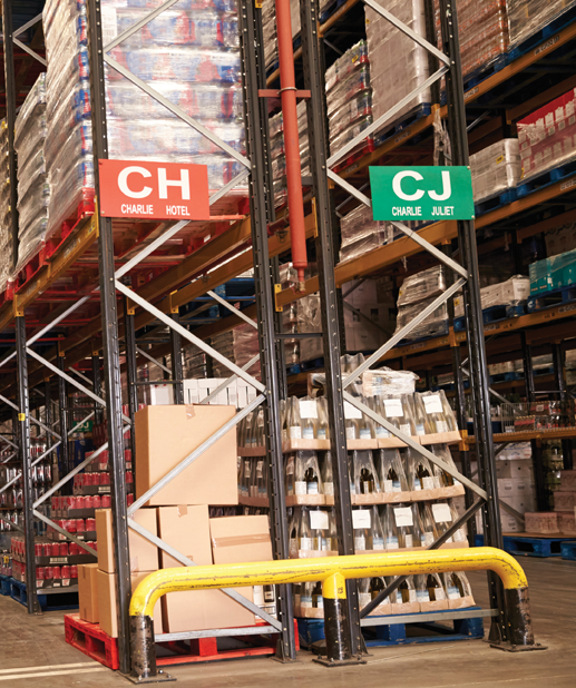
Aisles and Racks
Distributors often do a great job of creating bin locating systems in their warehouse, but they lack creativity when it comes to bin signage. Simple black-and-white labels are often overlooked. Consider changing up the color in each aisle to designate the velocity of the product. Create a “hot pick” aisle for those items most commonly ordered.
For those companies that require primary and overstock bin locations, signage can help speed up the efficiency of the pick. I typically suggest that distributors attach a bright green label next to any product with an alternate overstock location. On the label, you tell the picker where they can locate additional inventory if the primary bin doesn’t have enough product to fill the order. it seems simple, but it can be a real time saver.
Forms and Labels
By simply using different colored paper, distributors can eliminate confusion in the warehouse. Consider using two different documents in the order fulfillment process – a pick ticket and a packing slip. The pick ticket is an internal document designed to improve the efficiency of the order puller. The picking document may have multiple lines of description and it should be sequenced by bin location. Conversely, a packing slip is an external document designed to benefit the customer. It may have limited description and lines should be sequenced in the order given to your customer service representative. Using two different paper colors will help identify the documents quickly.
Colored labels can be used in several ways. Bin signage and process designation have already been discussed, but what about helping the shipping department? I like to see different colored labels used for carrier designations, such as small package or freight trucks. I have also seen colored labels being generated to separate and identify orders for internal delivery vehicles.
Shipping Dock
Just like the receiving area, the shipping department can be a whirlwind of different activities. In order to help differentiate product, introduce creative colors. If a company is not able to produce colored labels for shipments on internal vehicles, I often suggest designated shipping lanes. Adding colored cones to associate orders with vehicles will help the loading process. This concept can also work well for distribution hubs dealing with product transfers to other company locations.
I have also seen distributors use different color totes to designate order disposition. This could be used in conjunction with a quality control process or to simply organize items prior to packaging.
These suggestions are only a fraction of the ways that distributors use color to improve operating efficiency in the warehouse. Let your creativity and imagination run wild. Remember, we are already conditioned to take cues from the colors we see in daily life. Red means stop. Green means go. I thought that yellow meant caution, but I may be mistaken. If I can take any clues from recent Uber rides I have taken, apparently yellow now means go faster. I look forward to hearing about the creative ways you use color to improve the operating efficiency of your business.
 Jason Bader is the owner of The Distribution Team, which specializes in helping distributors become more profitable through strategic planning and operating efficiencies. For more information, call (503) 282-2333 or contact him by email at Jason@Distributionteam.com or visit www.thedistributionteam.com.
This article originally appeared in the Jan./Feb. 2018 issue of Industrial Supply magazine. Copyright 2018, Direct Business Media.
INDUSTRIAL SUPPLY MAGAZINE


The May/June issue of Industrial Supply magazine features an in-depth cover story about GHX Industrial. Plus, we're featuring articles by contributing writers Dr. Bharani Nagarathnam and Frank Hurtte, as well as interviews with numerous product and distribution industry experts.

