

Visualizations and data analytics: The competitive edge that drives profitability for industrial distributors
By Chris Blum
In today’s competitive market, managing your sales, or managing a high-performing sales team, goes far beyond setting quotas and tracking revenue. The ability to make informed, strategic decisions – quickly – is essential. That’s where data visualization tools (Salesforce/Tableau, Power BI, etc.) come into play. These platforms transform raw data into clear, actionable insights, empowering sales managers to lead with precision and confidence.

Real-Time Insights Driving Smarter Decisions
Sales environments move fast. Relying on static spreadsheets or outdated reports can leave you one step behind. Also, I like pictures! They make more sense to me. Visualization tools automatically pull data from ERP systems, CRMs, marketing platforms, and other sources in real time, giving you a live snapshot of your team’s performance. Connecting to multiple data sources is simple and intuitive, eliminating the need for complex queries or SQL script from IT personnel. Whether it's monitoring daily pipeline changes, deal velocity, or conversion rates, visual dashboards allow you to respond to trends as they happen – not after the fact.
Clearer Communication Across Teams and Customers
Numbers in rows and columns can be overwhelming. Visual dashboards simplify complex data, making it easier to share insights with your team, senior management, or cross-functional partners. Canned dashboards often don’t provide the flexibility to see what needs to be seen. Information displayed as a dynamic chart, or a heat map of regional performance tells a story at a glance. This data is also interactive, easily showing the relationship between the data. This clarity leads to faster decision-making and better alignment across teams and customers. It also allows for sales reps or managers to make small corrections, or large ones, that may prevent catastrophic scenarios if otherwise left unaddressed.
Ever have a customer ask you, “Send me a list of everything we have bought from you in the last year”? Usually, this is a warning sign that you are being shopped. Visualizations, as well as KPI data provided and made available in real time, can help you and your customers and keep you from having to be called on the carpet for something you sold six months ago. This type of service is a true “value add."
Individual and Team Performance Tracking
Whether a rep or a sales manager, your success hinges on your or your team's output. Visualization tools help break down performance by customer, rep, product, revenue, profit, region, or time. The more data, the better! You pick and choose what you want available to use. This granularity lets you identify top customers, products, manage and conversion and obsolescence. It can also easily review performers, spot those who need coaching, and uncover areas of opportunity or concern. Rather than waiting for end-of-month/quarter results, you can course correct midstream based on visualized data trends.
Forecasting with Confidence
We’re all sales folks. We hate planning and forecasting. However, one of the most powerful features of platforms like Power BI and Tableau is predictive analytics. By visualizing historical sales data alongside current trends, you can generate more accurate forecasts. This helps in setting realistic targets, managing inventory, and planning campaigns. It also enhances credibility when presenting projections to leadership or stakeholders.
Enhanced Goal Setting and Motivation
Leadership objectives are sometimes in conflict with what the individual sales rep thinks the objectives should be. Collaborating these and defining metrics then tracking those in real time allow sales reps to see their progress visually. When this happens it becomes a motivator, particularly if it is tied to income. Dashboards showing leaderboards, revenue growth, brand growth and product category, for example, can gamify performance and foster healthy competition. Visual KPIs not only keeps us engaged but also gives us ownership of their success.
Time Efficiency and Automation
Most sales reps hate CRMs if they require manual entry for every sales call, project, savings, etc. Fortunately, most of that data can be attained without a lot of manual entry (compared to five years ago). Building reports manually can be time-consuming and error prone. Visualization tools automate much of this process. Once your dashboards are set up, they update in real time with minimal input. This frees up your time to focus on selling, prospecting, coaching, strategizing, and closing deals—instead of chasing data.
Make it Happen
Incorporating data visualization tools isn’t just about adopting new software, it’s about transforming how you manage your sales or sales team. The ability to let Sales Reps and Leaders create and drive the visualizations is key. Gaining entry in using these types of tools is relatively inexpensive. There are many consultants and developers that help companies get off the ground with these solutions, allowing them to personalize it and improve it going forward. With clear, real-time insights, you can sell and lead more proactively, communicate more effectively, and drive better results. In a data-driven world, visualizing your sales data isn't a luxury, it's a competitive advantage.
Sidebar
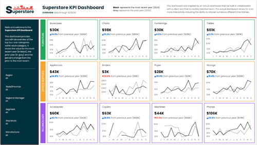
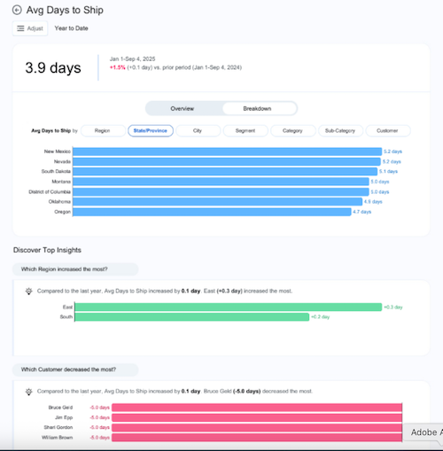
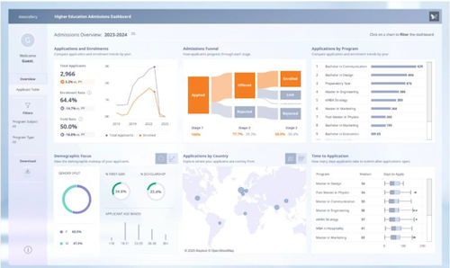
Sample Visualizations/Dashboards
It is very difficult to use a PDF or other static file, in showing the power of visualizations that can display the dynamic ability in analyzing the relationships across data.
It is these relationships that generally answer the deeper questions in looking at our sales or our business.
I refer to Tableau (a Salesforce product) as it is the primary BI Tool that I have used in the past and currently use. Tableau.com has a host of sample visualizations that highlight the power of these types of tools, ranging from the very basic, to highly complex Dashboards. Again, because of the dynamic interaction, a screenshot does not do it justice, however, you look at the view, you can imagine how the view changes, based on simple choices made in the data view. (Choices meaning, “click on Region,” see the impact, or use the filter box and change a variable and see the impact).
 |
 |
 |
 |
Chris Blum is president of E.H. Blum Company. He has over 35 years of experience in manufacturing and industrial distribution. Connect with him for more information about using visualization and business analytics tools to drive growth and profitability: ehblumcompany@gmail.com. Hear a recent podcast interview here. |
INDUSTRIAL SUPPLY MAGAZINE


The May/June issue of Industrial Supply magazine features an in-depth cover story about GHX Industrial. Plus, we're featuring articles by contributing writers Dr. Bharani Nagarathnam and Frank Hurtte, as well as interviews with numerous product and distribution industry experts.